My Canva Infographic Experience

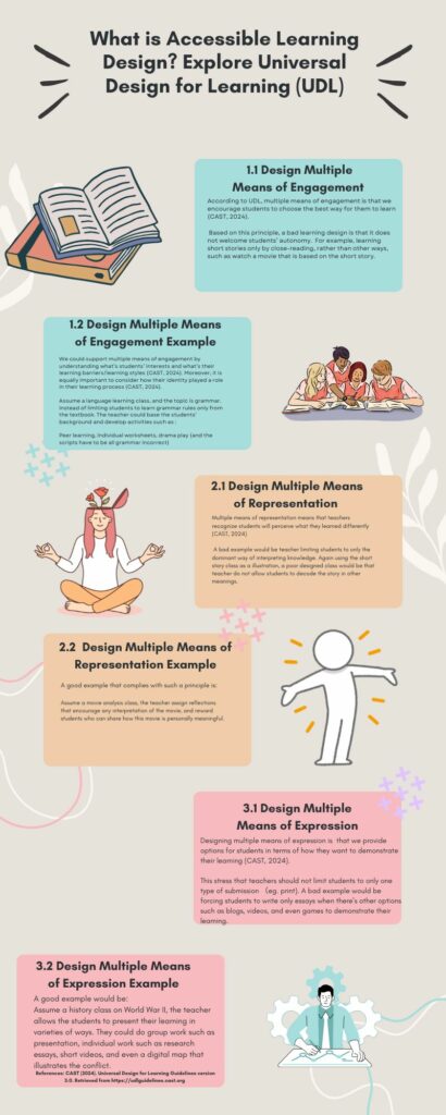
In designing canva, I wanted it to be both informational but not to cause cognitive overload. I decided to do the infographic that is on UDL, which is the topic of this module. As I was designing, I tried to extract the basic meaning for all three principles, and then provided a bad example/good example for each principles. In this way, my target audience (eg. teachers) will have a direction of how to apply these principles in their teaching.
I also used appropriate image for each of the principles, in this way, the image would help my audience to get the three “big ideas” of the learning principles. Additionally, I assigned matching color to the principle and the principle’s examples. In this way, my audience could locate and categorize the information, without have to find what my examples are relating to which learning principle.
What did you find when you ran the WAVE accessibility report on your blog post(s)? What did you expect and what was surprising? Is there anything you will do differently going forward?
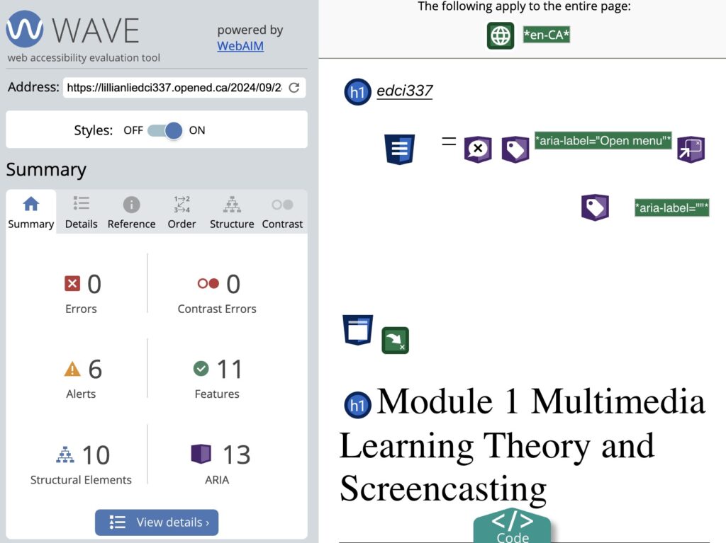
My Wave Report on the module 1’s post
Luckily, I do not have many alerts. I think this shows that my blog post is accessible. However, I have trouble understanding Wave’s recommendation to my headings.


I think WAVE point out that the default setting of WordPress is not accessible, and I could not change that. I also have problem understanding why my reference to YouTube video is somehow a problem for accessibility. One reason I can think of is that video is not friendly to users/viewers who are visually impaired. So this might be why WAVE is highlighting the issue. For me, I think WAVE did not help to know what areas I can improve because a lot of the icons in the WAVE report did not specify its meanings. Thus, I am not sure what the report is trying to do. I opened up every explanation for the icon, and it will simply say things like “YouTube video is present”, then it highlights it. I am guessing this is not a good indicator of accessibility, but again, I am not sure what it is trying to make me do.
Have you used Text to Speech tools before? Did you find it useful? Did you try out some of the different voices? What impact did the different voices have on your ability to absorb information?
I tried Read Aloud Browser Extension, I don’t think it is a good experience for me. The robotic voice is too AI, and makes me want to sleep (l am serious!). In the past, I had use this tool for some research paper. Some database has this function. For example, if I do not download the article, and just read it at its online site, there’s an icon for “Read Aloud” . It did not help me to comprehend the article at all because there’s no emotion or pause in the robotic voice. This creates even more workload for me because I need to read it again to understand which idea just ended, and what ideas are emerging.
I’ve tried out different voices, they all did not work. I tried to change the speed too, but there is always some weirdness about the voice that I cannot get over with. This is unlike watching a video or listening to a podcast. For podcast, sometimes I do not even need the transcripts in order to understand what the topic is about. Thus, I think actual human voice is very important to people’s understanding of the text. Even though the Text to Speech tool is using voice that sounds like “human voice”, but it does not compare to when an actual human read the text to other human.
What does inclusive design mean to you?
For me, I think inclusive design means that we are not only recognizing but also celebrating individual’s differences. This is a big challenge for a regular classroom because there are many students that we need to support. However, if I am the teacher, I would accept the challenge because I do not believe that we can make students to achieve their full potential if they follow the same learning path and did not have the chance to explore who they are and what they are good at.
I’d like to imagine a classroom like a garden, and students are seeds. A beautiful garden has many different flowers, grasses and even trees. Different flowers, grasses and trees need different care too. Thus, the first step for me in inclusive design is always to figure out what kind of seed is my student. Understand who they are first. Like the UDL principles, if we do not know who they are, how can we know what kinds of instruction to give that would allow them to engage in their own way?